After getting feedback on my first couple logos I pivoted and changed the logo completely. Again. Luckily, I am well aware that that is part of the process. Resulting in less frustration haha :) I took note that Graphic Designing is frustrating, but so entertaining all at the same time. When receiving feedback I was told to try totally new and different logo options. In that case everyone in the IA began spilling out there ideas like if the classroom were full of water hoses drowning me in logo options. I took them into consideration, however, I remembered a little snippet of advise from my friend Harry Bliss. He told me this: "Whenever I present my cartoons for the New York Times I always make sure that I like what I draw before I present it because if I like what i drew than I will make it the best I can." Remembering this valuable advise, I began creating the new Batch of logo options. Take a look -->
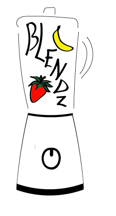
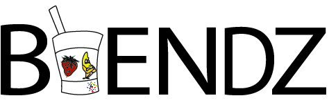
Option 7
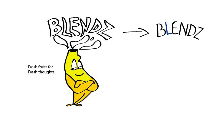
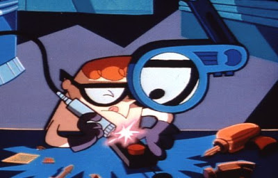
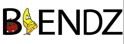
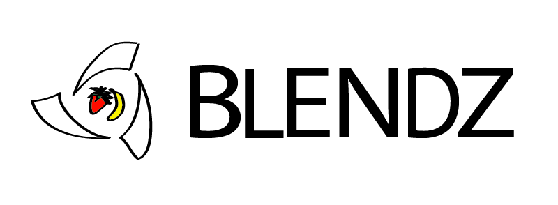
Option 7 being my personal favorite, I was gratified to present it to the class. While cogitating over the possible logo options I remembered one important variable, our slogan. Therefore, during this endeavor of incorporating our slogan into our logo, fresh fruits for fresh thoughts, I came up with this alternative. However, my critique feedback was an important question that I did not see coming: Do we, Blendz co, want to be referred to as a banana? Although I faltered to agree, it was an important question because even though we are a smoothie business we didn't only want be referred to as a banana. However, I did emphasize that the idea was pretty cool for a marketing campaign and to be incorporated somewhere on the website. Getting to the Results: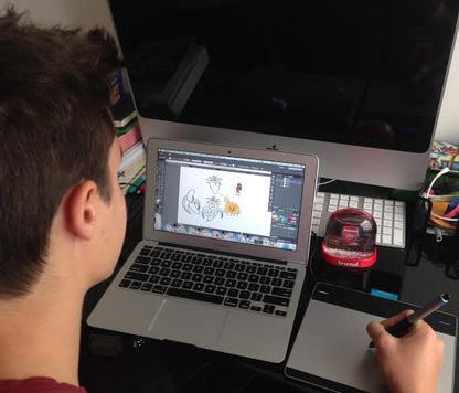 Having been diligent through out the process of creating logos, I do have to say that I learned SOO much. For example not only did I continue to experience/learn to pivot and learn from failure, but I also profoundly learned how to use adobe illustrator. Adding onto this amazing experience of the logo creation, I learned how draw on an incredible piece of technology called the Wacom tablet. To the side is a photo of Stefan's Laboratory :) Below is the final Logo :) (However, stay tuned because the creation of the blendZ character is still being created) 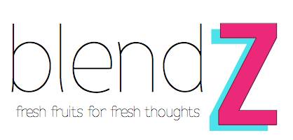
------ Fun fact ------If you haven't noticed, through out this article there are several words in bold. If you were curious enough to know why this might be, it is because I am currently studying and practicing SAT vocabulary words. Therefore, in my following blog posts you might notice words that are in bold, but now you know why that might be. Follow me on twitter to be on track of how my study habits are being set forth. 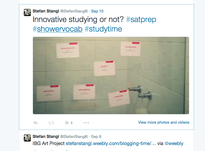
4 Comments
malena larrea
9/14/2014 06:01:25 am
congratulations on this amazingly professional endeavour. I personally liked options 1, 2 and 5 but they are all nice and creative.
Corey Topf
9/16/2014 11:55:26 pm
Stefan, the detail and thought you've put into this is impressive. You just want to be careful not to overwhelm your readers. Would it be possible to synthesize this more?
Andrea Hurtado
9/17/2014 12:10:08 am
Stefan!!! I completely agree with what you said. Creating the logo has been a challenging task, frustrating at times, but overall fun. It's been all about iteration and pivoting, because we are a new startup we are able to adjust our logo along the way with the feedback we receive. Therefore, this allows us to test our designs in the real world and see the customer reaction to it. I am very excited about the final design, now lets see how the public reacts on the second product test. Finally, illustrator is a lot of fun; it took me a while to understand it but I enjoy working with it.
Bill Cotter
9/22/2014 01:31:23 am
What I enjoyed about this blog was the way you explained the whole process of the design of the logo. I think that we often only see the final product and do not have an idea of all of the work that went into it. In this case we are able to see all of the work and iterations that you went through to get to your final design. Also, I really like your idea of bolding SAT vocabulary words that you are studying! Leave a Reply. |
BloggerMy name is Stefan Stangl and I am originally from San Francisco, California. Currently, I am senior at Colegio Franklin Delano Roosvelt in Lima, Peru. My passions are sports and art. 
Personal: @Stefan6 School: @fdrinnovationacademy 
♫Tweet me ♫
@StefanStangl6 CategoriesArchives
June 2015
|


 RSS Feed
